A speculative collaboration between Slawn and the New Museum, built as a small visual system across exhibition imagery, merch, and environmental mockups. The project imagines how a messy, character-driven graphic language could move from object to building to wearable thing.
A poster exploring how memory shifts, overlaps, and changes each time it is recalled. The design treats memory as something layered rather than fixed, using image, type, and composition to hold the distance between what happened, what remains, and what the mind quietly reconstructs.
A zine about the 'weird black girl' epidemic, using perforated french fold pages as both structure and attitude. The project treats publication design as a space for research, humor, specificity, and refusal, made for Advanced Research Seminar in Timo Kuzme's class.
A type specimen for Platform by Berton Hasebe, made for Core 1: Typography at Parsons School of Design in Prin Limphongpand's class. The project studies how a typeface can become a voice, not just through letterforms, but through pacing, scale, hierarchy, and the way a page asks to be read.
A political zine about how Putin's governing style, capturing courts, controlling media, and eliminating dissent, has traveled beyond Russia and been adopted by leaders in other countries. The project uses print as a compressed research object, holding history, warning, and pattern recognition in one place.
Noctis, named after the Latin word for night, is a digital exploration of memory, war, and the way the past is never truly lost, only waiting to be recalled. The website treats darkness as an interface condition: something that hides, reveals, stores, and returns. Made for Core 2: Interaction in Betty Wang's class.
A poster series that reinterprets Olympic visual language through bold typography, image-making, and movement. The project explores how a global event can be translated into a graphic system that feels immediate, energetic, and built for public attention.
Save the Rain is a poster about water conservation and the urgency of protecting rain as a shared natural resource. The design turns an environmental message into a direct public signal, using bold imagery and typography to make sustainability feel immediate rather than abstract.
Ya’aburnee is an Arabic expression meaning “you bury me.” It describes the wish that someone you love will outlive you because life without them would be unbearable. The project explores the tenderness and weight inside a phrase that can also be understood as “I don’t want to live without you” or “I’d die for you.”
A poetic video about someone who believes all hope in life and love has been lost, only for connection to find him when he least expects it. The project moves through loneliness, uncertainty, and the quiet surprise of discovering that hope can return before you are ready to look for it.
A file-folder imitation book about what happens, what gets filed away, and what it means to be a Black creative moving through school, work, taste, expectation, and proof. The format borrows from administrative language while holding something much more personal and slippery.
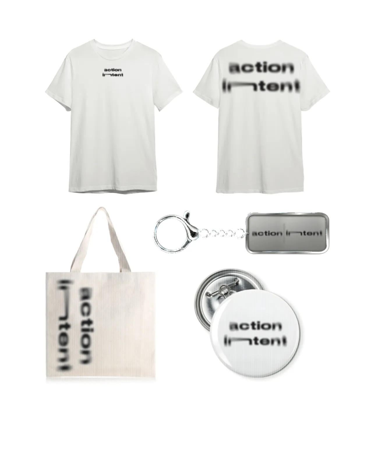
A motion, logo, and clothing design project built around the mantra Action Over Intent. The work translates a phrase into a wearable and moving identity, thinking about how type can become motivation, object, and personal reminder at the same time. Made for Core 1: Typography.

.webp)
.webp)
.webp)
.webp)
.webp)
.webp)
.webp)

.webp)